top of page

Typography Posters
 Didot, Eifel Tower design | 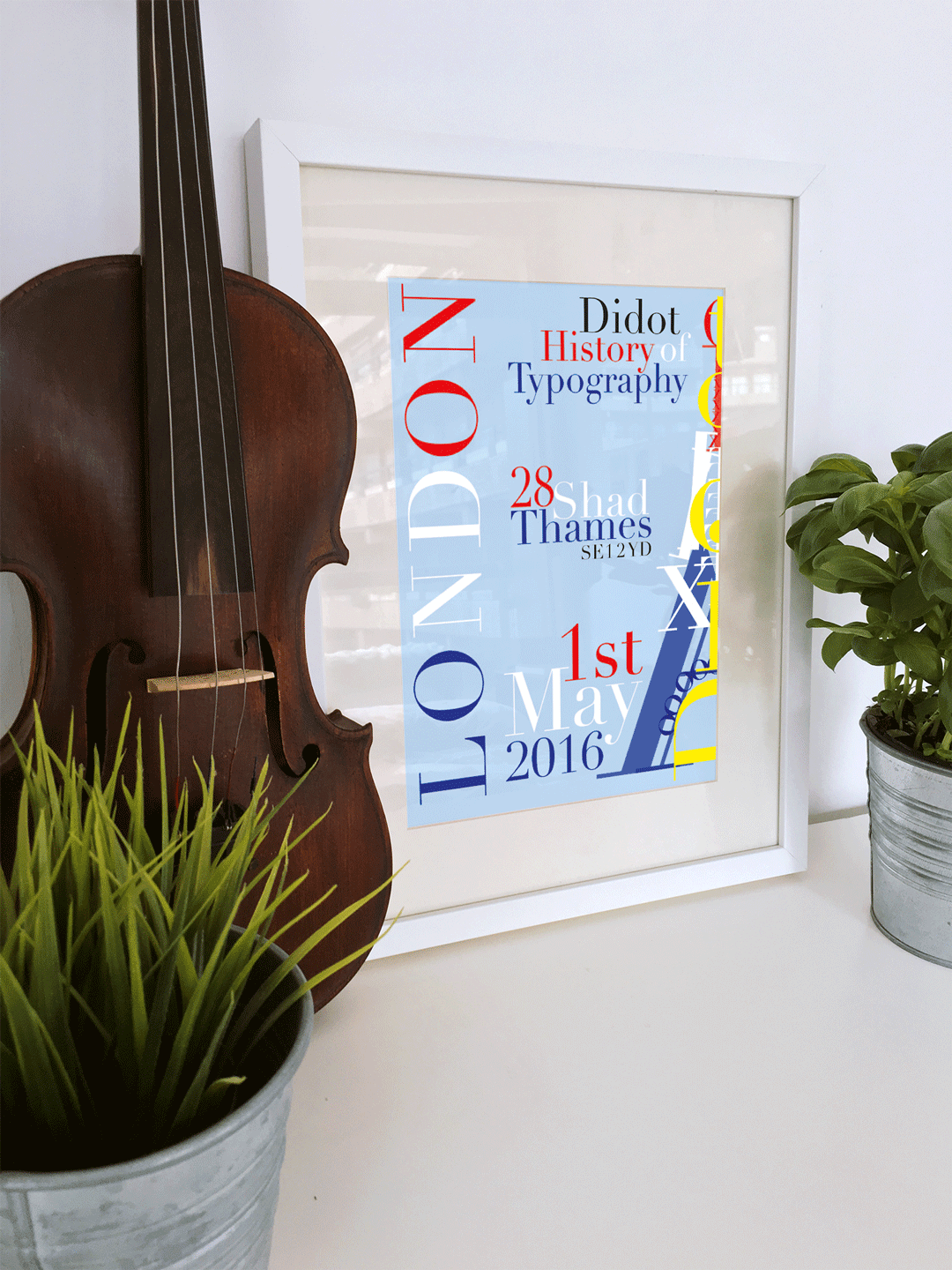 Didot poster 2 | 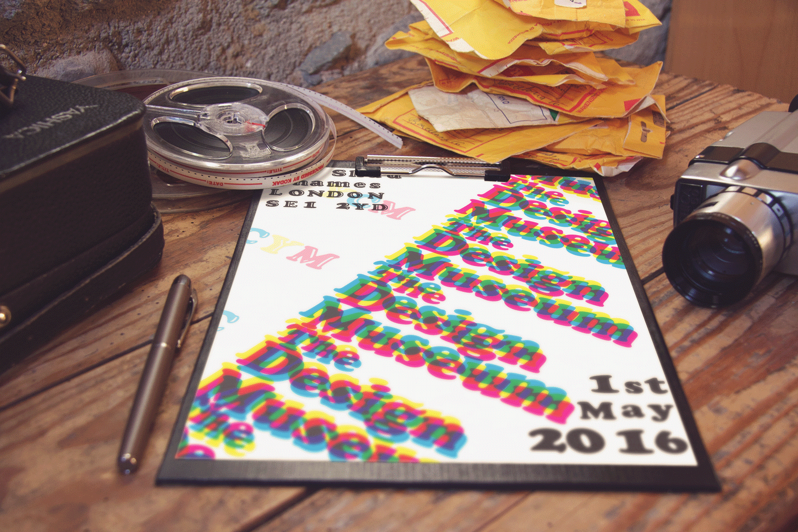 Cooper Black poster 1 | 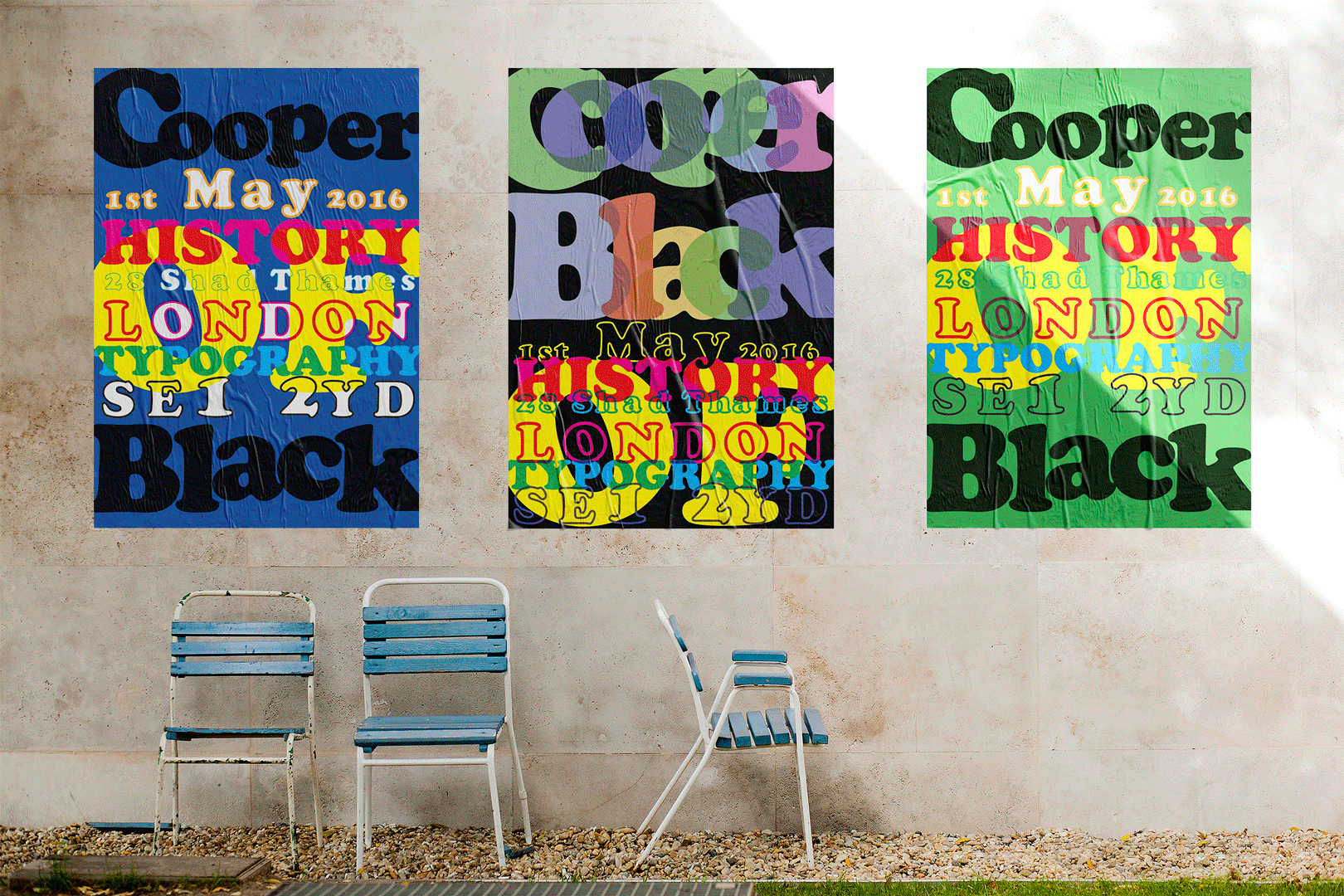 Cooper Black posters |
|---|---|---|---|
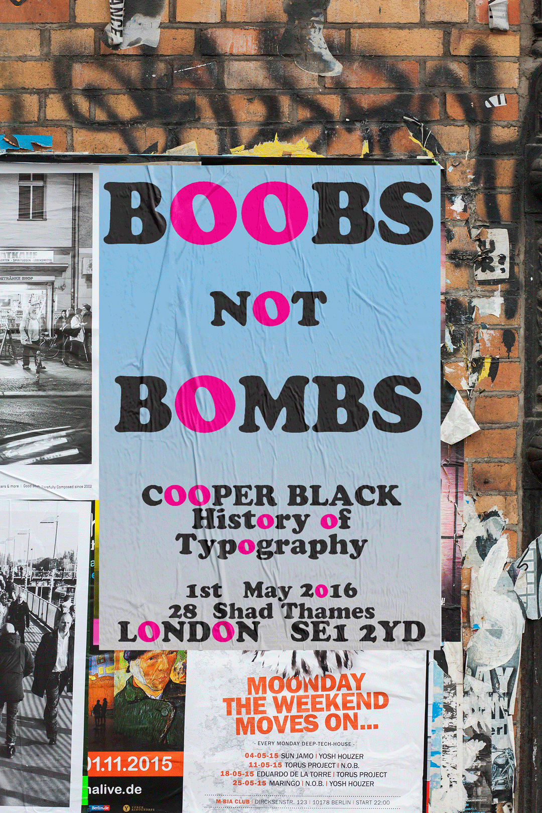 Cooper Black, reactionary poster to the 2016 French terror attacks |
Tools used:
Illustrator, Photoshop
Typographic posters showcasing the characteristics of the typefaces Didot and Cooper Black.
To gain an understanding of the history typography I set about researching iconic typefaces, their creators, and foundries that produced them. I considered famous examples of the use of each typeface, the message it was used to convey, and the tonality of the communication. Typefaces I researched for this project included Helvetica, Baskerville, Times (and Times New Roman), Futura, and Gill Sans.
The fonts I chose for the poster designs were Didot - a late 18th Century French font; and Cooper Black - designed in the USA in the 1920’s.
bottom of page